A bold rebrand proposal for SwissDev, combining a strong geometric mark with confident typography to reflect precision, reliability, and modern Swiss engineering standards in the construction sector.
2025
Smart Project, Structured Vision
A contemporary rebrand proposal for Smart Project, combining a bold geometric mark with clean typography to reflect architectural precision, structure, and forward-thinking design.
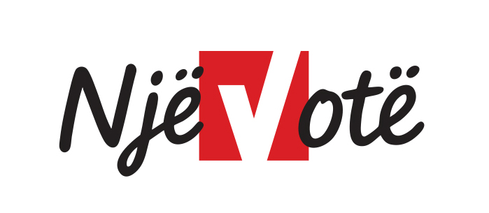
Leading one of the most consequential local election campaigns
The Nje Vote movement and the mayoral campaign of Valon Prebreza marked one of the most dynamic and strategically executed local election campaigns in Kosovo’s recent political history. Conceived as both a civic call to action and a political platform, the campaign combined a bold visual identity, a unifying narrative, and a highly coordinated communication strategy across digital, print, outdoor, and grassroots channels.
2024
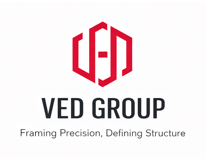
Framing Precision, Defining Structure
This symbol was designed for VED, a manufacturer of architectural window systems, translating the core function of framing into a bold and geometric visual identity. Constructed from interlocking vertical forms that suggest both the initials V, E, and D and the structure of window frames, the mark communicates precision, stability, and architectural clarity.
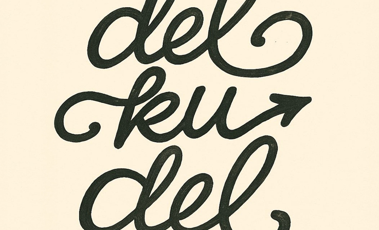
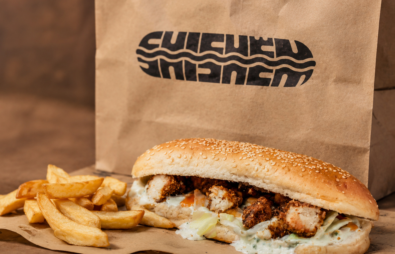
A visual identity for Shishëm, a street-food inspired brand whose name literally means “tasty” in Albanian.
2021
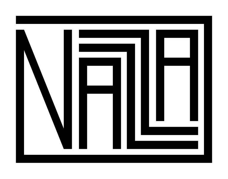
Couture Elegance
This logo for NAZZA embodies refined minimalism and couture elegance, using a sophisticated, high-contrast monogram structure to reflect the exclusivity, precision, and timeless femininity of her solemn dress creations.
2019
Capturing the Identity of a City Through Community
The visual identity for My Prishtina is built around a symbol that subtly integrates the letters MY and PR, forming an abstract monogram that simultaneously reinterprets the iconic Goddess on the Throne terracotta figure from Ulpiana, one of the most important archaeological symbols of Prishtina. This dual meaning bridges past and present, connecting the city’s ancient cultural heritage with a new generation of photographers documenting its contemporary life.
An energetic and humorous illustrated logo created for Piskama, a digital platform focused on funny and entertaining content. Inspired by the Albanian word for “scream,” the identity captures loud reactions, exaggerated expression, and playful chaos through bold shapes, dynamic typography, and character-driven illustration.
2003
Mascot & Emblem Illustration for Tifozat Kuq e Zi
An expressive mascot and emblem illustration created for Tifozat Kuq e Zi, the official supporters of the Albanian national football team.
 View project