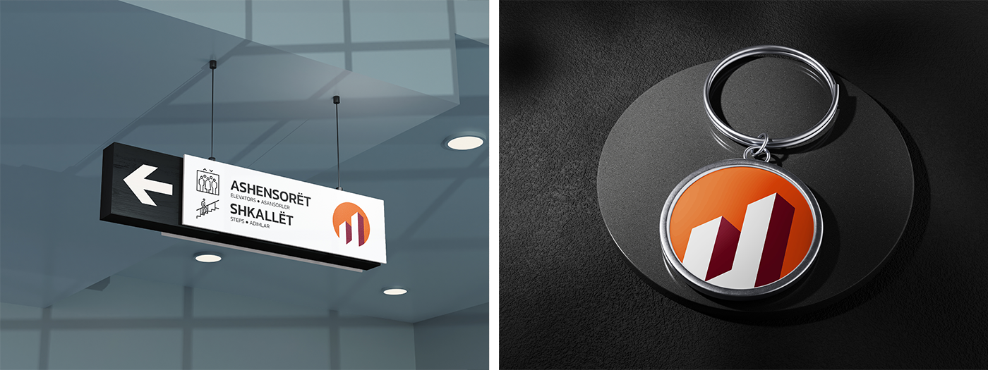
Balancing architectural precision with warmth
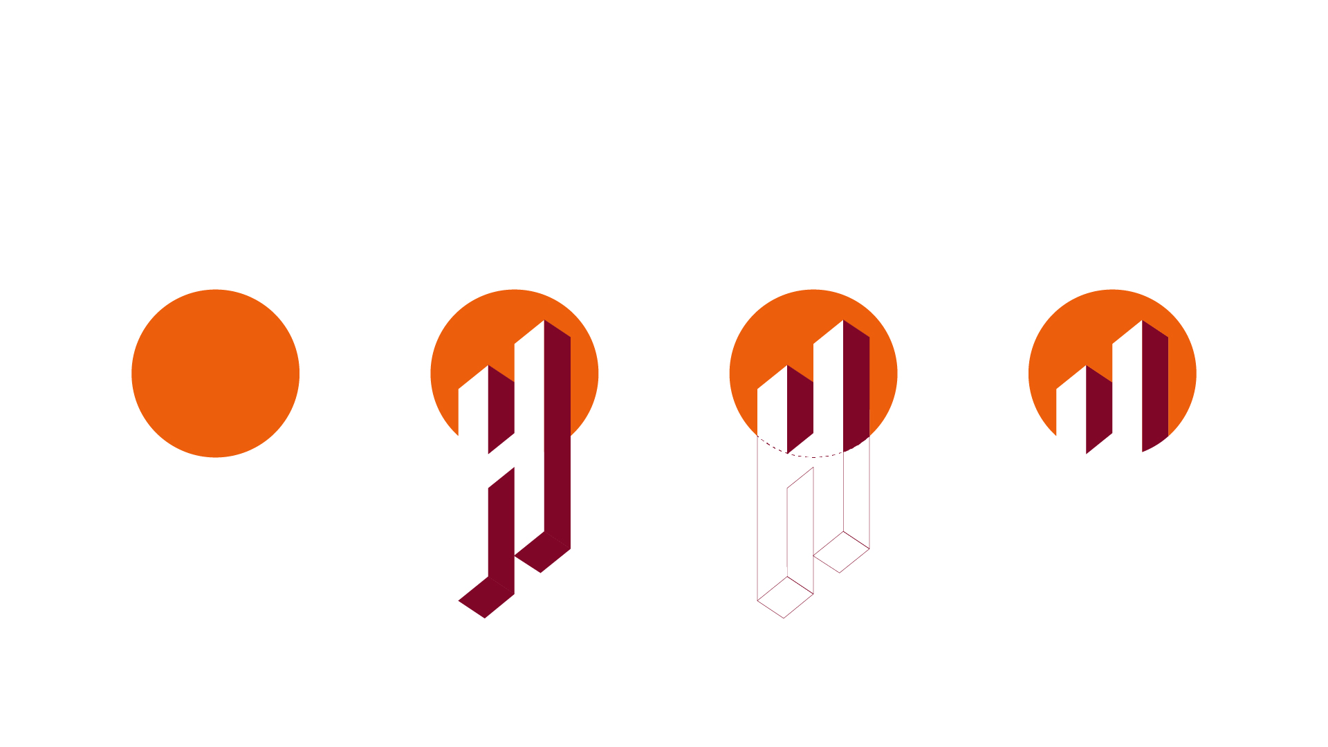
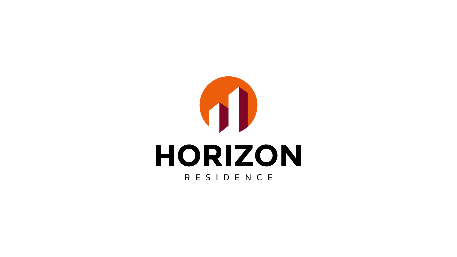
The logo symbolizes rising architectural forms emerging from the horizon: two ascending structures framed within a warm sun-disc. The geometric shapes reflect stability, growth, and perspective, while the orange and deep red palette conveys energy and solidity.
A visual identity that feels both premium and approachable within the growing residential market of Kosovo.
The mark is simple, scalable, and highly adaptable across signage, construction branding, and environmental applications.